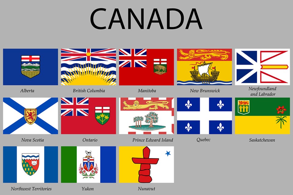
It’s one of the hottest debates to hit my family’s dinner table in a while. We couldn’t stop talking about it. So here it is, ready for you to jump in, if you like.
Here’s the task: rank the flags for the territories and provinces of Canada, worst to best. Not diving too deep into the symbolism or history, just what looks cool. It got heated, but was fun. I hope you’ll take it in the same spirit. No offence meant, and feel free to provide your own feedback in the manner you see fit – you can see all the flags in the graphic above. Hat tip to the Godfather of rankings, the great Justin McElroy, currently off travelling the world, ranking chicken wings in some faraway land.
OK, Let’s rank flags, 13 to one. Who’s the best? We’ll see, but first, the worst:
13. Northwest Territories: Sorry, NWT, but this looks like something a Grade 4 student would come up with in a “design a flag” art project. Two strips of blue, a big white square, and what is this crest? Is this a scene from an Atari video game? Woof.
12. Ontario: That’s, just … two other famous flags, pasted on a red background. And they thought adding in three leaves would tie it all together? Look at it a little askew, and it’s a red Pac-Man eating a Union Jack.
11. Manitoba: This is what happens when you cheat off the homework of a kid who is also failing. Of all the flags that you could copy, you chose Ontario? What is this, some kind of CFL Roughriders/Rough Riders type situation? Same country, same flag!
The only reason this is ranked higher than Ontario is because there’s a cool bison on there. Sorry you’re on such a lame flag, bison. This is the worst thing Canadians have done to you since, well….
10. Yukon: This one is kind of all over the place. My kid says he likes “the vibe.” I think the crest is weird – what is up with those bootleg mountains? – although the flowers are a nice touch. The green and blue stripes just seem … off. But, there’s a doggie on there. That goes a long way.
9. Prince Edward Island: “We now go to the fairway on 15, he’s looking at about 165 yards to the pin. A couple of trees to contend with. He’s got his nine iron out, looks like he’s going to try to put a little fade on it and spin it up close to the hole. He’s got to be sharp though – the last thing he wants to do is knock it over the green into that extremely long lion.”
And why do the red dashes stop? Did they run out of red ink? Somebody grab some Anne of Green Gables red dye #48 and finish this flag.
8. Saskatchewan: There was a lot of debate about this one. I’m biased as my people come from there, and the yellow and green scratches an old itch. Not for half of my family though. “I’ve never liked green and yellow,” is the quote. It’s “plain.”
Oh, the disrespect. That’s the wheat that bakes our bread! Probably. Another nice flower too. But I get it – for you big city slickers, maybe this one is a little bit too country. Agree to disagree.
7. British Columbia: OK, now it’s getting hostile. I have a kid furious at me for putting our home province this low. It has a “happy look to it,” and should be near the top, he says. To that I say it’s just … really busy. There’s the big sun and the big waves and they’re all wearing the Union Jack as a hat. Tone it down several notches, and then let’s talk.
6. Alberta: Like the blue, love the mountains. Again, though, England for a hat, with a barley beard. I like it, but it’s not quite Top 5.
5. New Brunswick: I love the boat, and that’s a unique colour scheme. If I just look at that boat some more, I could see this flag sailing all the way to No. 1. But there’s that weirdly long lion again. It’s like a lion limousine. If New Brunswick could get themselves a regular lion, they could win this whole thing. Not unanimous though. “It’s so ugly,” says one unnamed ranker. Tie her to the mast!
4. Newfoundland and Labrador: Is that a torpedo? Arrows? A dragon? Not sure what is going on, but I like it. Chart your own course, NFLD. Let it fly!
3. Quebec: Now that’s a flag. Strong, defiant, great colours, cool emblem, no messing around. A real “French vibe,” my kid says. Mais oui.
2. Nova Scotia: If you’re going to steal someone else’s flag, add a bit of flair to it. Behold, the “reverse Scotland.” Nice. And would you look at that? A relatively normal-sized lion. Was that so hard? Simple, cool, classy.
1. Nunavut: I’m as surprised as you are. Initially this was a lot lower, but the more I looked at it, the more I liked it. Bold colour choices. And everybody loves an Inukshuk. And a single star in the sky? As the kids say, very sigma.
Those are the ranks, I’m sure you hate them. Tell me all about it.
Andy Prest is the editor of the North Shore News. His humour/lifestyle column runs biweekly.


